
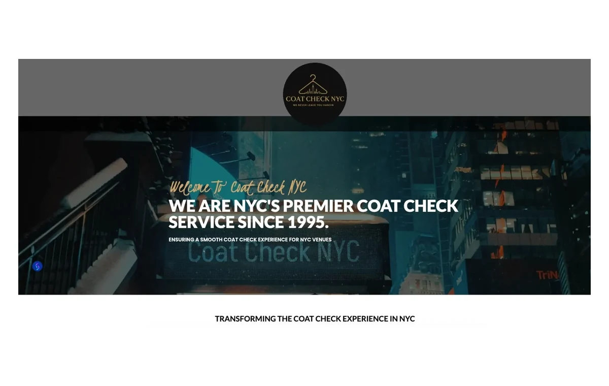
Answer the first question immediately
A visitor should not have to decode the business. The first screen should give enough context to understand the offer and who it is for. Clever language can add personality, but it should not replace clarity. If the visitor has to scroll several times before learning what the company actually does, the homepage is making the user work too hard.
Give people a reason to keep going
After the opening message, the homepage should establish relevance. That might mean selected projects for a designer, services for a local business, products for a retailer or a short explanation of what makes the offer different. The content should match the questions a new customer is likely to have.
Use proof near the point of doubt
Trust signals are most effective when they support a decision. A testimonial can reinforce a service section. A recognizable project can support a claim about experience. A review count or years-in-business statement can help a local service company feel established. Proof should be integrated into the story of the page rather than collected in a random block at the bottom.
Do not offer ten competing next steps
Strong homepages usually have a primary action. For one business that may be “Request an Estimate.” For another it may be “View Work,” “Book an Appointment” or “Shop Now.” Secondary links can exist, but the most important path should be visually clear.
Repeated calls to action are useful when they appear after meaningful information. Repeating the same button in every few lines without adding value can feel aggressive.
Structure the page around customer questions
- What do you do? State the offer clearly.
- Is this for me? Show services, categories or relevant problems you solve.
- Can I trust you? Show work, reviews, experience or other proof.
- What happens next? Explain the process or give a clear action.
Mobile is not the smaller version of desktop
On a phone, the homepage needs to become even more disciplined. Headings should wrap cleanly, images should not force horizontal scrolling, menus should be easy to operate and calls to action should not disappear below oversized decorative sections. The order of information becomes especially important because visitors are seeing one narrow column at a time.
A homepage is a starting point, not the whole website
The goal is not to squeeze every service detail, company story and FAQ onto one page. The homepage should create orientation and confidence, then lead people into the deeper page that matches their intent. That is what makes it useful.